I shall not go into all the history of S-M again here, as I covered most salient points in the recent Serpent Calendar article. That said, the information offered then mainly covered up to when Peter Speake and Daniele Marin left the business in or around 2017. Since then, under the leadership (and presumably ownership) of Christine Rosnoblet, production has continued, and It is clear from the watches offered that the designs maintain some of the original S-M traits. All that said, this DNA continuity did undergo a big change earlier this year when the company launched a new stainless steel “chic” sports watch at Watches & Wonders. This was called Ripples, and the three immediate and striking aspects were; the dial decoration, position of the running seconds, and the case shape. All of these amounted to quite a striking and radical appearance.
At this point, it is worth mentioning that the sports-type watch market is simply saturated with models. Practically all brands include such a piece in their repertoire, and at all price points – Patek to Tissot, AP to Longines and so on. As such, it is a very tall and brave order to launch yet another one, because to succeed, one has to tread a very fine line between offering something different to catch the eye, yet not too radical as to put people off. In addition, there are price consideration aspects to consider.
Now, as folks may know, I am not that keen on very radical features, and so a departure from the usual norms is a bit alien for me. In fact, as per the Watchlogic site details, if I really do not like something, I would prefer to simply avoid reviewing. That largely remains my position, but, in this instance – whilst I had some misgivings, as it was S-M I was willing to be more open-minded and investigate further! At this point I would just say that even as a “Johnny come lately”, I have avoided reading too many other reviews by others. So, what I have mainly done is to look at the S-M press launch pack and exchanged a few emails with them. I will of course be interested to study other comments once finished!
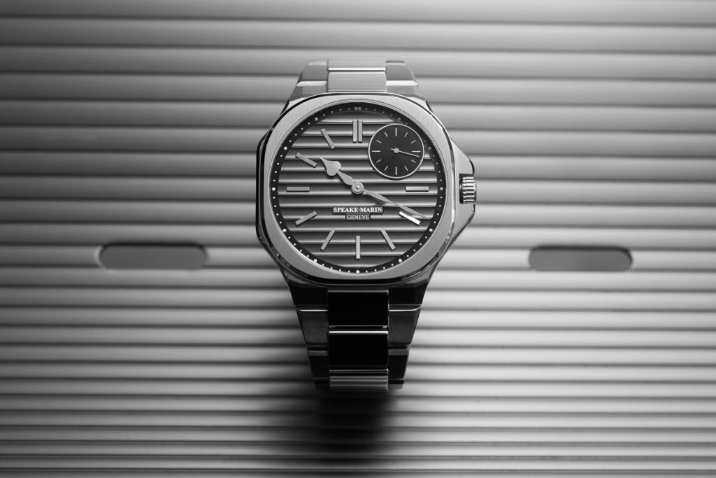
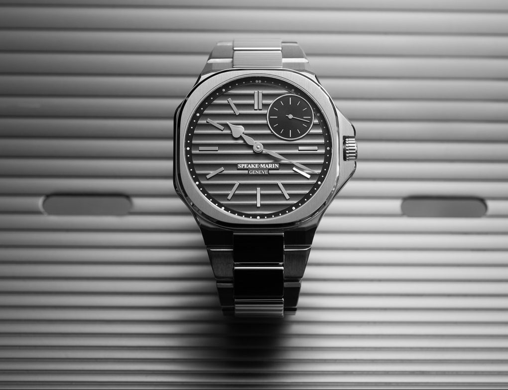
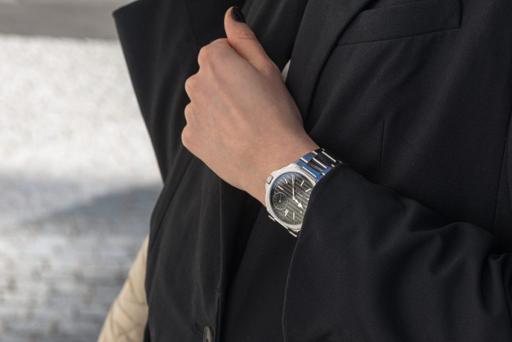
So, to the Ripple – ref 604015040. Well, whatever else, the initial appearance does grab you! The general case shape is called La City and is apparently a nod to Peter Speake’s London roots. At 40.3mm, along with it’s general shape and chunky crown guards, my initial impression was that it looked a little like a Bell & Ross/Panerai union! The bezel is quite dominant, and although the inside is circular, the outer extremities are not. Also, it does not match the underling case shape – overlapping at the corners. The surfaces are mainly brushed, with polishing on various bevelled edges. If one looks carefully – particularly where the bracelet joins the case, there are some quite intricate and interesting angles on show. The traditionally shaped screw-down crown is all-but enveloped by the guards, and sports the S-M topping tool logo.
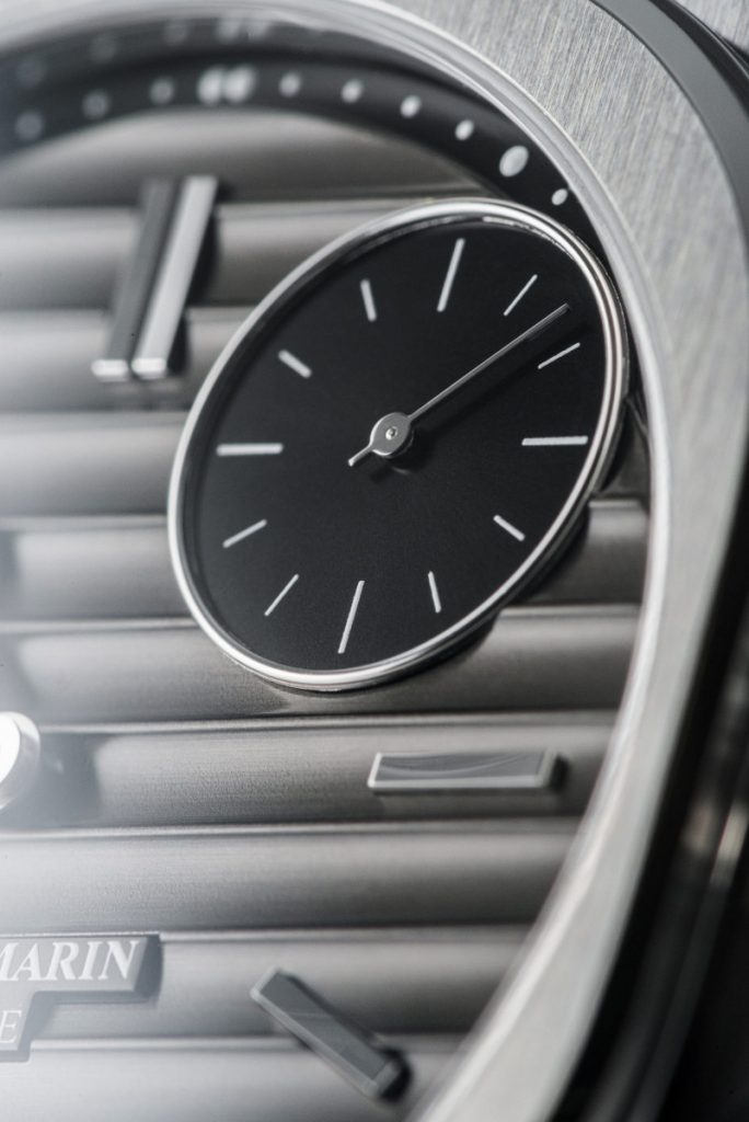
Now, that dial! It is in a “cool grey” hue and displays prominent ridges/waves which are some 0.3mm in height. They are formed by a stamping process, then a satin finish is applied by hand, and finally the colour – via galvanoplasty. These elements – and more, are supposedly a nod to the Thames and London architecture. Then there is a black outer rehaut, with hour and minute dots. The running seconds dial at 1.30 is in black, and encircled by a raised metal band. Within resides a simple hand and hour batons. That is all certainly pretty unusual (possibly unique to the brand) and has caused some debate. To be fair, it is all rather subjective, but, as readers will know, I personally like symmetry as far as possible. There are then applied batons for the hours, then the old fashioned hand shapes in the S-M trademark way – pear/spade for the hour and double feiulle for the minutes. All are in polished metal, and they feature no lume. All is glazed by non-reflective sapphire.
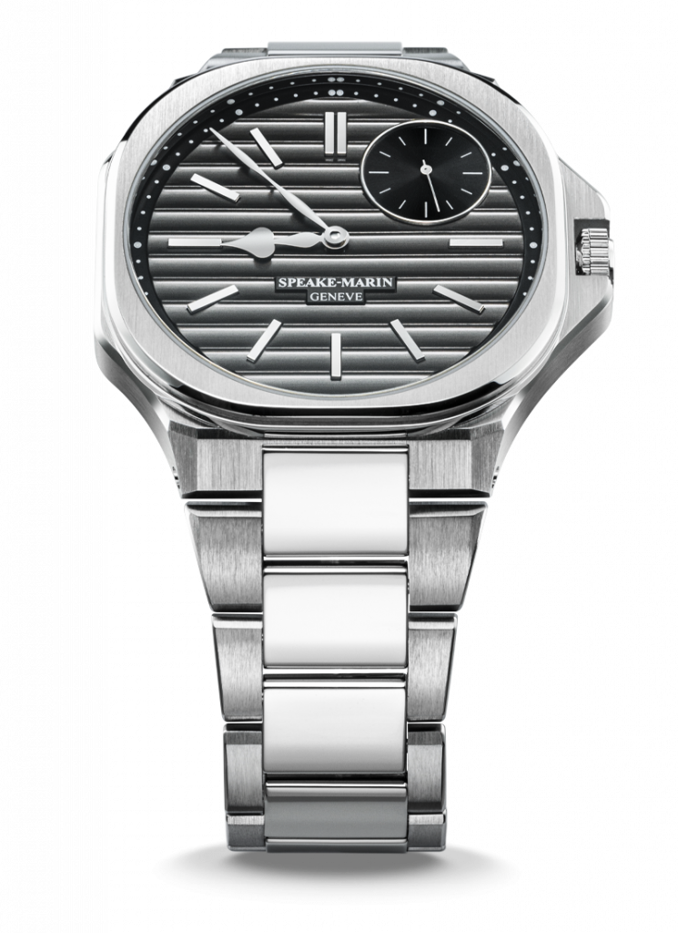
The neatly integrated bracelet is quite striking, with alternate and non-aligned brushed outer links with polished inners. I think this works pretty well here.
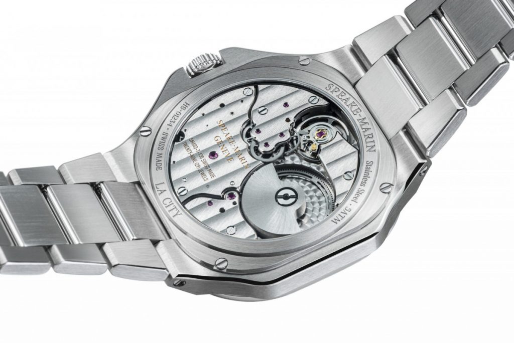
In terms of the mechanics, I am sure there are no issues here. The SMA03-T automatic movement is made by a firm called Le Cercle des Horlogers, which was started in 2012 by Alan Schiesser and Nicolas Herren. I am not really au-fait with this business – or the personalities, but from their website they seem offer some half dozen calibers that can be modified/decorated to suit. The caliber in this watch is exclusive to S-M and would be viewed as in-house really, as the Rosnoblet family also own it!
In terms of caliber details; the dimensions are 30mm x 3.9mm, and within are 147 components – including 29 jewels helping along a 28,800 vph. A useful 52 hour power reserve is noted, with accuracy cited at +/- 5 seconds per day.
The view from the back is good and reasonably attractive, with some quite heavy Cote de Geneve striping, perlage and anglage. The rotor is of a micro variety, but it is a shame that it has no real decoration (aside from very fine brushing), or colour, so it looks a little lost. A bit of gold here might have been nice – or even the S-M bluing as on previous models, just to give a bit of colour pop. However, there are some purple rubies on show, and the brand name is picked out in gold. I note that waterproofing is noted at 5ATM.
So, my conclusions. Well, first off one has to congratulate S-M in producing a new and different model. It goes without saying that the cost of development and production will have been substantial. Like other good manufactures who do not have bottomless bank accounts, S-M have adopted the etablisseur method, i.e. sourcing some components from trusted quality third parties. Some people can be a bit snobbish about this, but personally I have no issues with that.
So, to the aesthetics. This is where things get a little more tricky. As mentioned before, in such an overloaded sector you have to offer something different in order to be noticed – particularly if you are a “comparatively” new and niche brand with little long back catalogue to draw from. If you are, say, Tissot, its much easier. You simply refine, improve, and modernise a much older successful watch – and in recent times the worthy PRX range was the result. For S-M, the initial plan may have worked well in that attention has been grabbed. But having done so, what do folks really think? Whilst I am OK with the case design – albeit a little confusing, I am a little less convinced with those ripples as I think they are a bit too dominant – although the 3D effect up close is pretty cool! Additionally, that running seconds dial clearly does not need to be at 1.30, and for me would look more balanced at say 6. As they say, just because you can (or have), doesn’t mean you should! The hands? Well, I suppose if you wish to perpetuate an S-M feature then that is what you do, but I am not sure they quite work on such a modern-looking watch, plus, are also a little overpowered by those ripples. For the Serpent, for example, the case design and overall look was “older marine/pocket watch” in flavour, so the hands worked well.
The Ripple is undoubtedly a visually striking watch – but whether some elements try just a bit too hard to be different is a moot point. I am sure the build quality is very good, and the mechanics fine (although of a little unknown quantity), but as ever with watches, it is that initial visual impression that is all-important. I think in this case, the like/dislike effect will be too stark for many. Finally of course you have to consider the price, which at some CHF 19,900 (around £17,000 today) is no small beans. Bearing in mind my personal reservations – and the fact that no precious metals are used – or say, any COSC certification offered, I do feel this is just a bit too expensive. All that said, many of my queries would be viewed as subjective, so, others of course may like the unusual and bold aesthetics and be content to pay the price for what, after all, will be a low output piece (100 per annum. Ed). Hopefully the watch will gain traction, and whilst not really for me, I do wish Ripples well – with a polite nod!
Rating: 3.5/5
Words: The Writer
Images: Speake-Marin